An Android Review for iOS Users: Home Screens (Day 2)
This is part 2 of a 5 part series on Android from the perspective on an iOS user.
- Part 1: Third Party Apps
- Part 2: Home Screens
- Part 3: Notifications
- Part 4: All the Little Things
- Part 5: Conclusion
Today's post is going to be quite a bit more positive than yesterday's, as home screens is somewhere Google definitely has Apple beat. Frankly, if I could have Android home screen with iOS's everything else, I'd be a very happy camper. Android has a stock launcher that is better than iOS's, and also has the ability for third party developers to create their own launchers so that if you don't like what Google offers, you can change it up.
PSA: Your default launcher probably sucks
Let's get this out of the way up front. Unless you have a select few phones, your phone likely comes with a default launcher that isn't so hot. Samsung has their own launcher, as does LG, HTC, and most other OEMs. None of these launchers are all that great, as they lose all the benefits of Google's launcher while gaining none of the customization options you get from a third party one. You should at least install the Google launcher, or maybe one of the many other third party ones out there.
Remember there's an app drawer
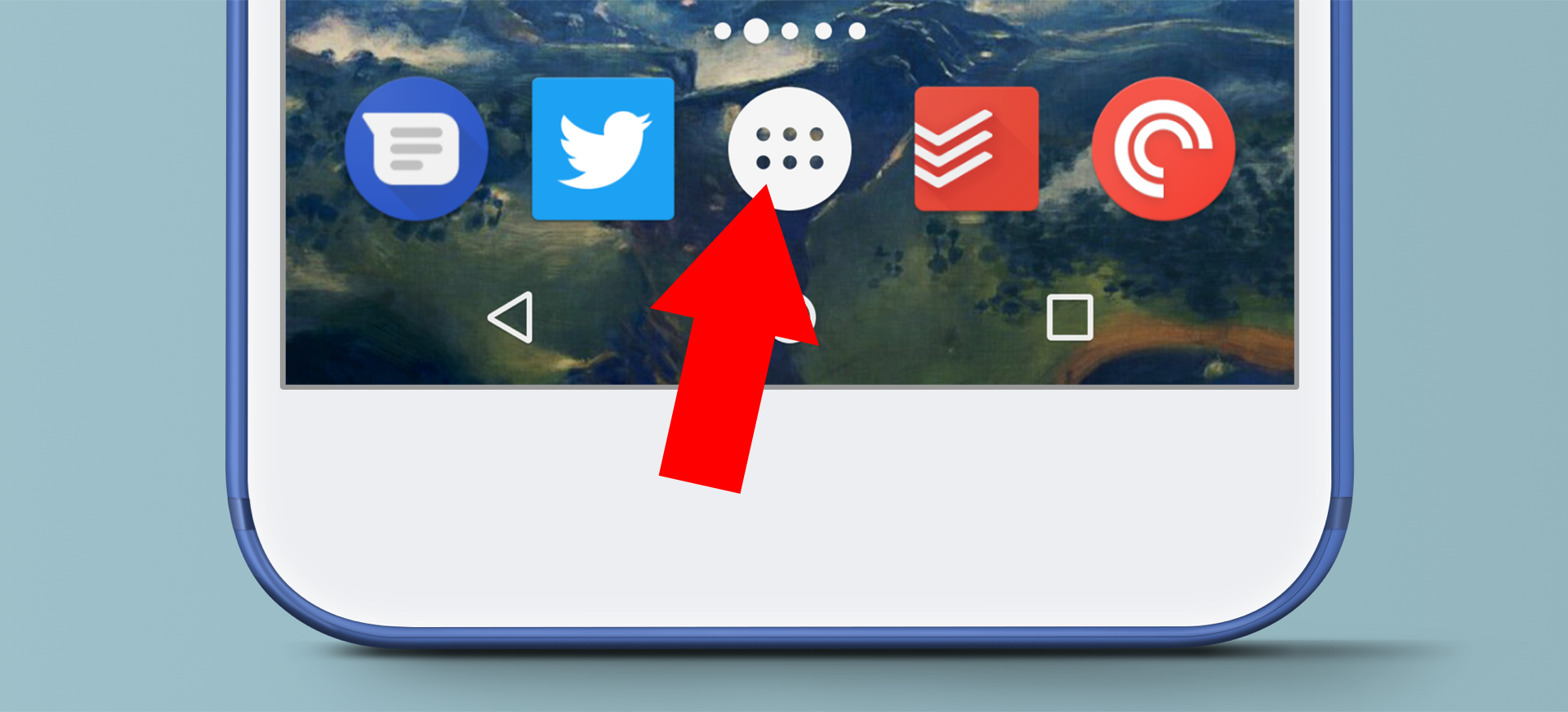
While iOS adds all apps to your home screen for you to sort out, Android has what they call an app drawer. All of your apps sit in this drawer and you can pick and choose what ones get added to your home screen1. This is wonderful for someone like me who has many apps installed and doesn't like them taking up a ton of home screen space.
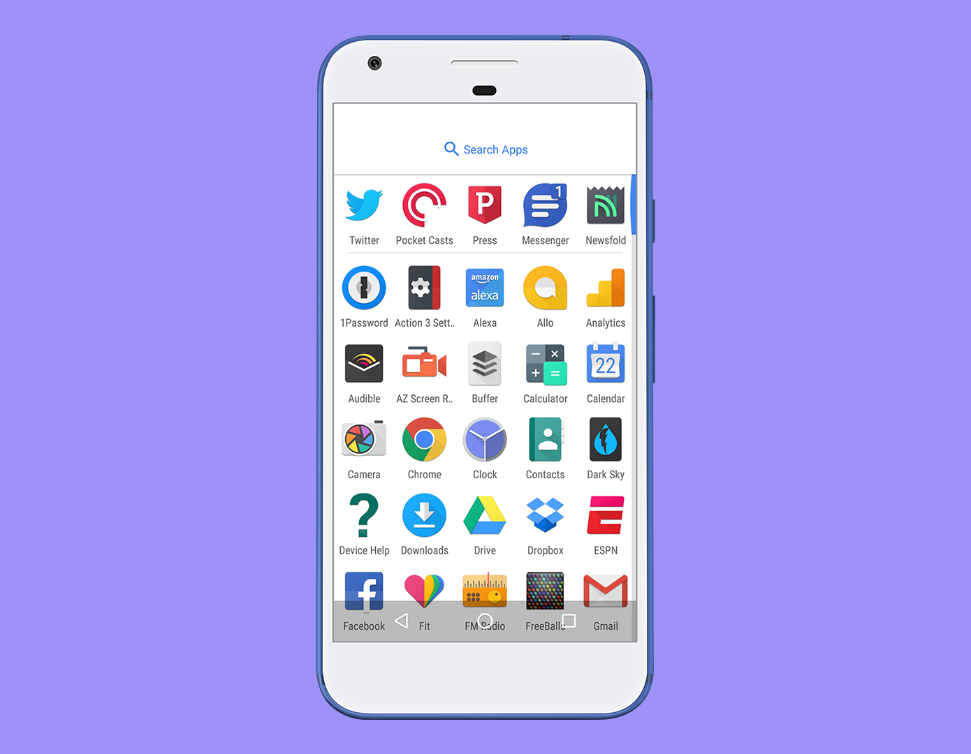
This means that all of my frequently used apps appear on my home screens, while everything else sits in the app drawer for those rare occasions I need them. It's subtly different than putting everything in an "Extras" or "Junk" folder like most of us must do.
Not all launchers have this feature, but the standard ones all do, as well as basically every other third party launcher, and for good reason.
Google Now Launcher
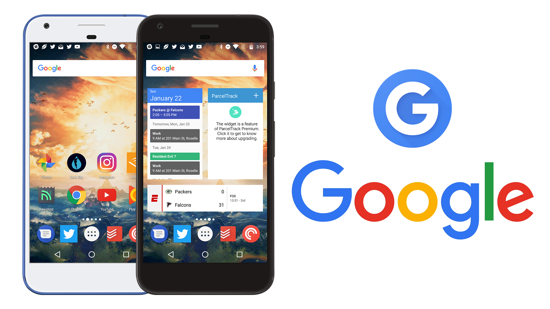
This is the one you're going to want to install for most normal people on Android. It's simple, and fast. It's also the only launcher that can use Google's vaunted Google Now service.
The home screen itself is just as simple as the iOS home screen, but it has a couple advantages over iOS. First is the ability to place icons wherever you would like. iOS makes you place icons on each page from the top down. This made some sense when screens were 3.5 inches and your thumb could easily reach the entire screen, but it doesn't so much in 2017 when iPhones are pushing 5.5 inches. This is a big win for usability on Android.
In addition to icons, Android also allows for widgets on the home screen. This is something that has long been a difference in the platforms, and while I don't use them myself, I do see their value. I personally don't use widgets because they are not useful in general for me. Still, I'd rather have the ability to have widgets on the home screen if I want then not have the option at all, so point for Android.
Finally, this launcher gives you Google Now, which is Google's assistant feature to compete with Siri. You can say "Ok Google" from the home screen to trigger the voice assistant, and you also get a page to the left of your leftmost home screen that displays information Google thinks would be relevant to you at the current time. In the screenshots I have for this piece, they came during the depressing Green Bay vs Atlanta NFC Championship game. That score is sad, but the feature is nice. Google knows I am interested in Packers scores, so it shows it to me there. Apple has made some moves with this in their "proactive" features since iOS 9, but it's not even close to the same level.
The one note I have here is that I have come to really enjoy iOS 10's widget page on the home screen. I like being able to put exactly what I want there so that when I swipe over to that page I know exactly what I'm going to get. Google Now is good as guessing what I want to see, but it's not always right, and is therefore unpredictable.
I like the Google launcher quite a bit, and it would be my favorite launcher if it were not for the next on I'm going to mention. Google has refined this launcher experience for years, and has arrived on something pretty good. Not amazing, but good, and definitely better than what Apple is offering with its home screen.
Action Launcher 3
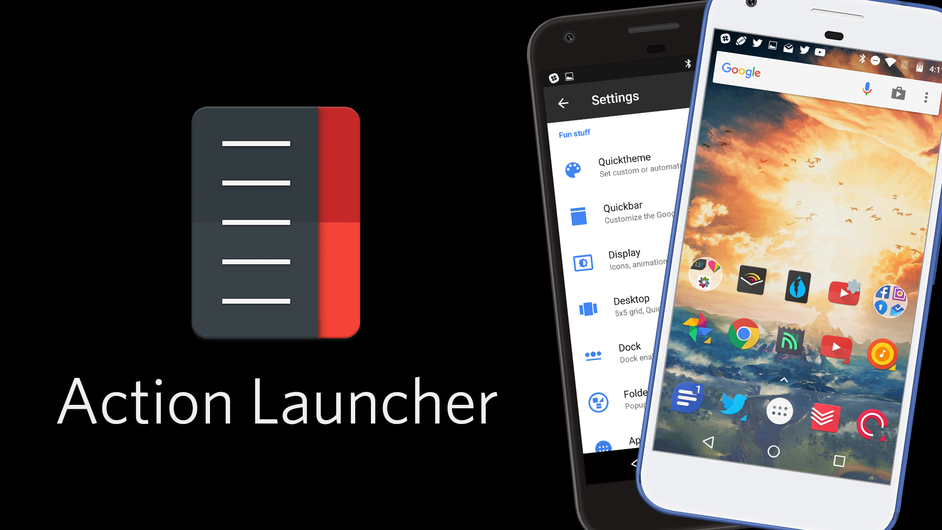
Now we're talking! Action Launcher is my go-to launcher because it's fast and clean like Google's own launcher, but it's also very customizable. I've set mine up to act as much like the Google Pixel launcher as possible, but I could pick and choose what parts of the home screen I want to make certain ways. I can have the search bar at the top look like Google's, like it's own thing, or totally remove it, and I can also change the icons with icon packs, change the icon size, decide how dense I want the icon grid to be (I go 5x5 over the stock 4x4 for my device), and there are theme options for how I want all UI elements to look.
It's pretty solid.
I also appreciate Action Launcher's commitment to bringing the newest Android features to old versions of Android whenever it's possible. My phone is running Marshmallow, which is 2015's Android hotness, but Nougat is out, and has been for months. Sadly I'm like the vast majority of Android users and liver perpetually behind the curve.
The most notable example right now is the ability to swipe up on an icon to bring up its quick actions. For example, here's Twitter's quick actions:
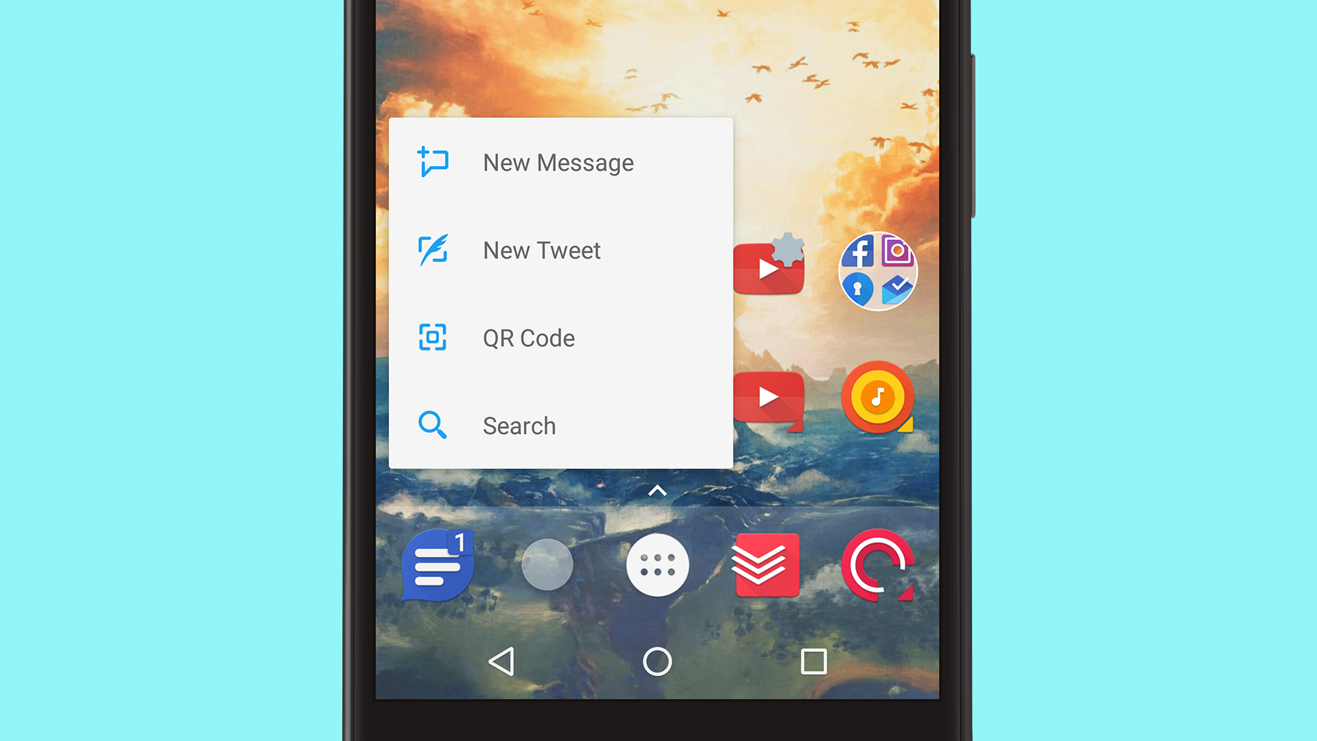
Just like the same feature we're had on iOS since the iPhone 6s, this is a great feature that I use all the time, and it's only possible on my device because of Action Launcher. We could get into how almost no non-Google apps have implemented this feature yet, but let's not bring down the party (seriously developers, this is great, and you should support it).
And all the rest
These are just the 2 launchers I have found myself gravitating towards, but suffice it to say you've got options. Nova and ADW are longstanding leaders for those who want to have an old-school launcher with tons of customization options. These launchers are very similar to the stock Android lunchers of years ago, but give the options to make the look exactly how you'd like. People who are big into a custom look to their phone tend to gravitate towards these launchers.
And then there are the launchers that break the stock Android mold and give you something different. Launcher 8 is out there if you want to make you home screen look a lot like Windows Mobile (🤢 but okay), and Yahoo's Aviate and Z Launcher try to fill your home screen with apps based on your time and place. It's trying to guess what you'll need at any specific time, which is cool, but none of these work the way I want them to.
I'm happy all of these launchers exist, and I'm happy that presumably all of them make at least one person out there happy, but none of these special launchers do anything for me. This flexibility is what makes Android good, but it also means that there's going to be a bunch of things out there that just don't land with you personally.
Day 2 wrap up
This is a much less apocalyptic area than the third party app situation we dove into yesterday. The iOS home screen has hardly changed in 10 years, and it's due for an overhaul ASAP! It's not a reason to say "iOS doesn't innovate anymore" or "Android is better because of this" but it is definitely a point in Android's column.
I don't think Apple needs to open up custom launchers as a thing in iOS 11, but they do need to take a good hard look at what they have now and make some long-needed changes. Get a small team working on new home screens and see what they come up with. Get a little crazy with things and mix it up a bit. If Apple was making the first iPhone today with a 5.5 inch screen, there is no way they would settle on the home screen they have now. We're only using this home screen design due to years of momentum. It does technically still work, but it's a part of the OS that needs to have its second wind.
- Note that the default behavior actually does add those to the second home screen, just like iOS, but you can change the behavior as well as being able to remove them at any time without uninstalling. ↩