Apple Watch Series 5 Review: One Major Feature and One Major Question Mark
The newest Apple Watch is an odd duck when it comes to updates for Apple’s “more personal device ever.” Depending on your measurement, it’s either the most or least significant update to the hardware Apple has ever put out, and that just makes it a funky product to review. For some history, these are what I’d consider the highlights of previous Apple Watch updates.
- Series 1/2 improved performance from “bad” to “tolerable” and the Series 2 got GPS
- Series 3 improved performance to “freaking awesome” and added a cellular option
- Series 4 was a full redesign with a much better screen, more performance gains, and a mother-flippin’ ECG
So what does the Series 5 bring to the table?
- Series 5 adds an always-on screen
Yeah, that’s basically it, but let’s jump into what exactly that means for this product.
What Stayed the Same
Before we hit the always on screen, let’s talk about what stayed the same from the Series 4. The Series 5 has effectively the same processor1 as the 4, right down to clock speeds, so there is no upgrade in performance this year. This is fine for me, as I’ve never thought the Apple Watch is slow for a couple years now, and this is really a compliment to the silicon team at Apple for being so far ahead of anyone else out there.
The screen (outside of the always on trick) is exactly the same as well, sporting a 448x368 LTPO OLED display in the 44mm model2. It still has the same screen-to-body ratio as last year and looks great on the wrist.
The haptics remain unchanged as well, and they still feel very good across the board.
The aluminum models look the same, have the same color options, and and indistinguishable from last year’s models. There are new finishes in the Edition line, with titanium and ceramic options, but I didn’t spring for those this year and can’t speak to them. All I will say is the ceramic one looks hot and I wish I could justify the cost for it.
Always On Everything

But like I said, the one significant new feature in the Series 5 is the new always on display. I have two things to say about this before we get into more detail:
- For some people this will be reason enough to upgrade from any Apple Watch, even the Series 4. For many others, it will finally convince them to jump on the Apple Watch train for the first time.
- Apple is doing the feature way better that what other smartwatches are doing with always on screens.
Why This is a Big Deal
I’ve never had a very hard time seeing the time on my Apple Watch. From the very beginning I’ve been mostly accepting of the “raise to wake” gesture since it was mostly easy to do, and in the 3.5 years I’ve been wearing an Apple Watch, I’ve gotten used to it to the point I rarely thought about it as a limitation. That said, those rare times it didn’t work, like when I was in bed or when I was in a meeting and tried to subtly look at the time, it was indeed a bit frustrating.
Now that the Series 5 always shows the time, my success rate at seeing the time on my watch has gone from 98% to 100%, and that last 2% is very satisfying.
Another reason this is a big deal is that it makes watch face choices mean a hell of a lot more than they used to. Previously, your watch face was really just for you. The rest of the world only saw the black slab of the Apple Watch’s off screen, but when you raised it to your face you personally got to see the face. Now that the screen is always on, your watch face is visible to the outside world at all times, and it made me think more about the watch as a fashion item. Not only does my watch face need to give me the time, information, and look good to me, I want one that gives off the right feeling to the rest of the world. Maybe that’s silly, but fashion matters to everyone, even if you don’t really want to admit it.
But it’s not just fashion, it’s a great step in adding some diversity to the Apple Watches you see in the wild. We all know what an Apple Watch looks like, and people have tons of band options to personalize their watch to their liking, but the watch itself always looks the same. Now everyone will be able to have their own look from the screen to the band, and I think that’s pretty great.
This Ain’t Your Father’s Always On Screen

Always on screens are nothing new to smartwatches, as most Wear OS and Samsung watches support this feature. These watches usually blank out the display and then flash up a new watch face that’s a minimized version of whatever watch face you’re using. From what I’ve used, this means just the time remains, and all on-screen complications disappear.
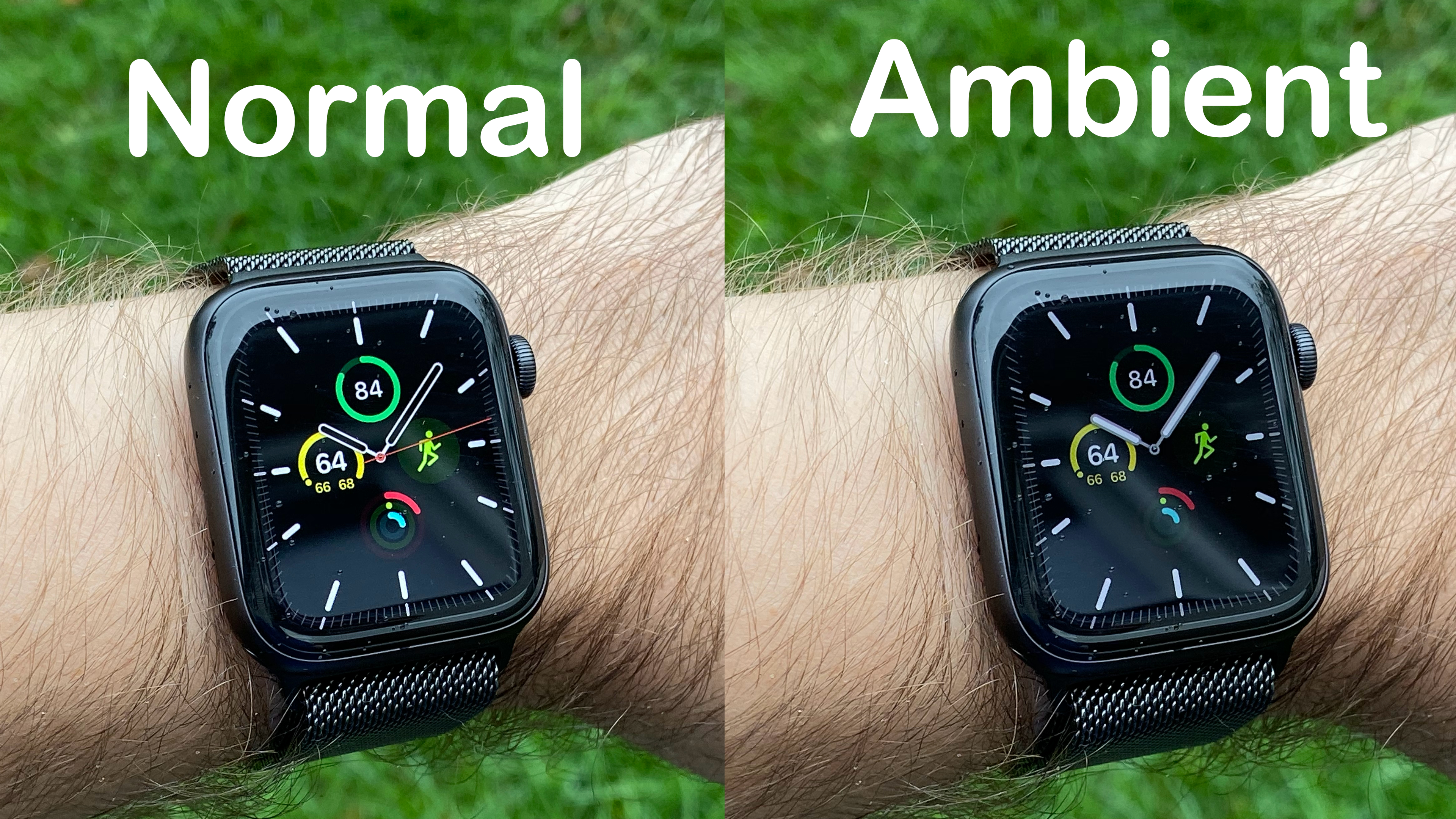
Instead, the Apple Watch Series 5 smoothly dims the screen from normal to always-on mode, and then brings up the brightness smoothly when you tap the screen or raise your wrist. It gets it to the point where I often can’t even tell if the screen is in its normal mode or always on mode. When you see them one after the other you can definitely tell, but when you just glance at your wrist, I never really know what version I’m looking at, and that’s probably the point.
Inconsistent Behavior

My biggest problem with the always on screen is how watchOS handles it in software. Here’s what’s good:
- If you’re on the watch face, the screen fades out to the always on watch face and looks great.
- If you’re in an app and smack your palm on the screen to turn it off, you go straight back to the watch face (because you’re gesturing you want to close the app).
- If you are in a workout, your data stays on screen and updates once per second.
But there are other times when the always on screen doesn’t work that well.
- When using navigation, the directions should always be displayed. Instead the watch goes into a “semi-on” mode that blurs the navigation until you raise your wrist. This should be like workouts and show you the next move at all times.
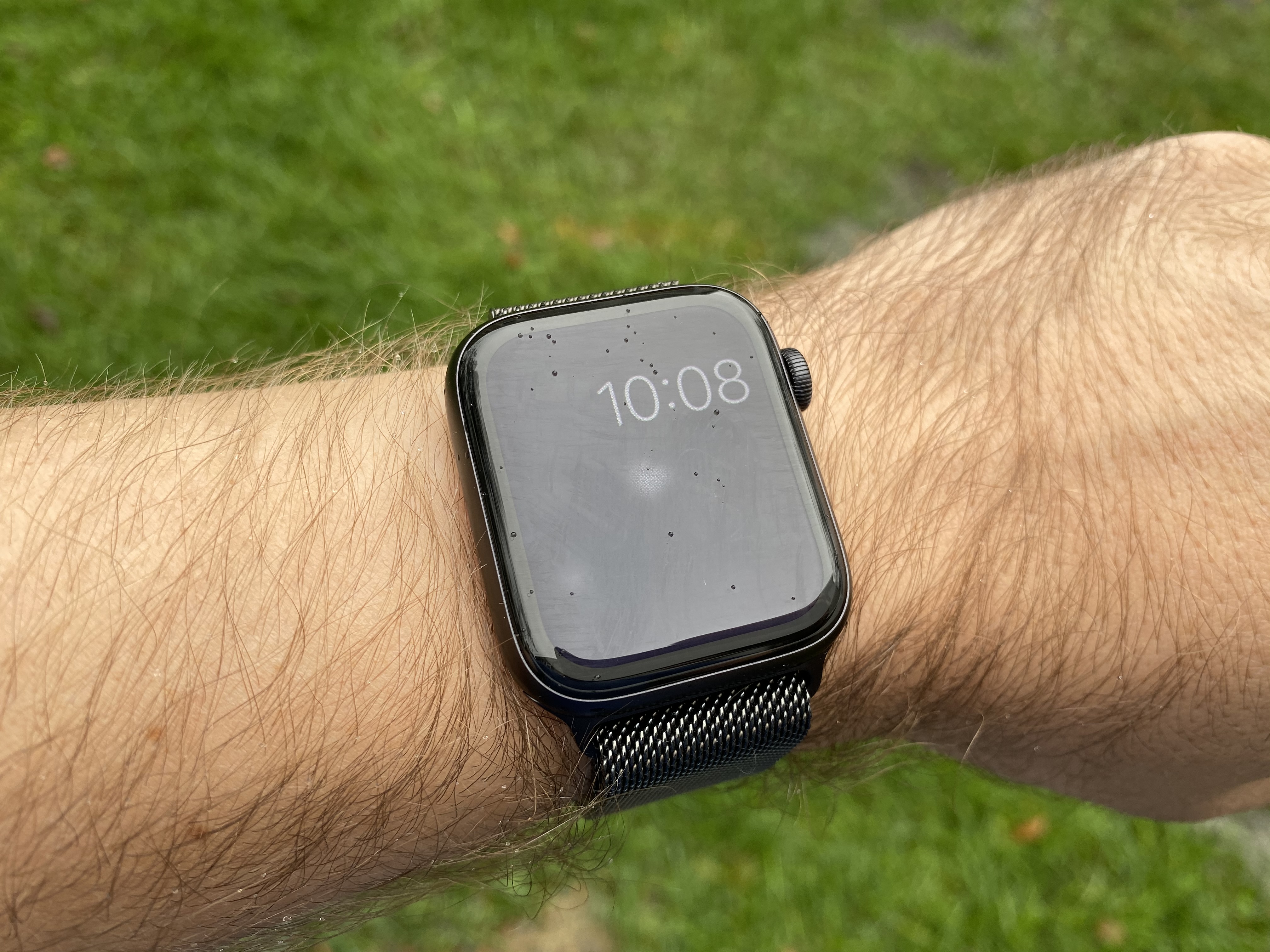
- The Now Playing app (or the app for whatever app is playing audio) makes the watch face go away and you get the blurred version of the media controls. This is not useful and means for hours each day I get the blurred clock screen, not my actual watch face.
- Notifications come in, I glance at them, and lower my wrist, and the notification stays on the always on screen (in the blurred view) for a minute or two.
Basically, I don’t like the “blur the running app and show the time in the upper right” view and every time I see it I feel like the watch isn’t doing the right thing. Maybe for the first issue above Apple would say you shouldn’t be looking at your watch while driving, but why do they have navigation there in the first place if that was their feeling? Similarly, why not do that if I have walking or transit directions and am not driving a vehicle?
Here are my solutions to the 3 issues I have:
- Treat Maps like Workouts. If I’m currently navigating, show me the current directions on the always on screen. Updating every second is completely fine for navigation just like workouts.
- Either make the Now Playing app show on the always on display or preferably, just show my watch face on the always on screen and if I raise my wrist show me the media controls.
- Notifications if I lower my wrist while a notification is displayed, wait like 5 seconds and then go back to the watch face. If I’ve looked at it and didn’t do anything, the vast majority of times I’m done with it and don’t need to see it again in 30 seconds when I go to check the time.
This isn’t a disaster by any means and I still enjoy having the always on screen, but this first implementation has some behavior quirks I don’t agree with.
Battery Life

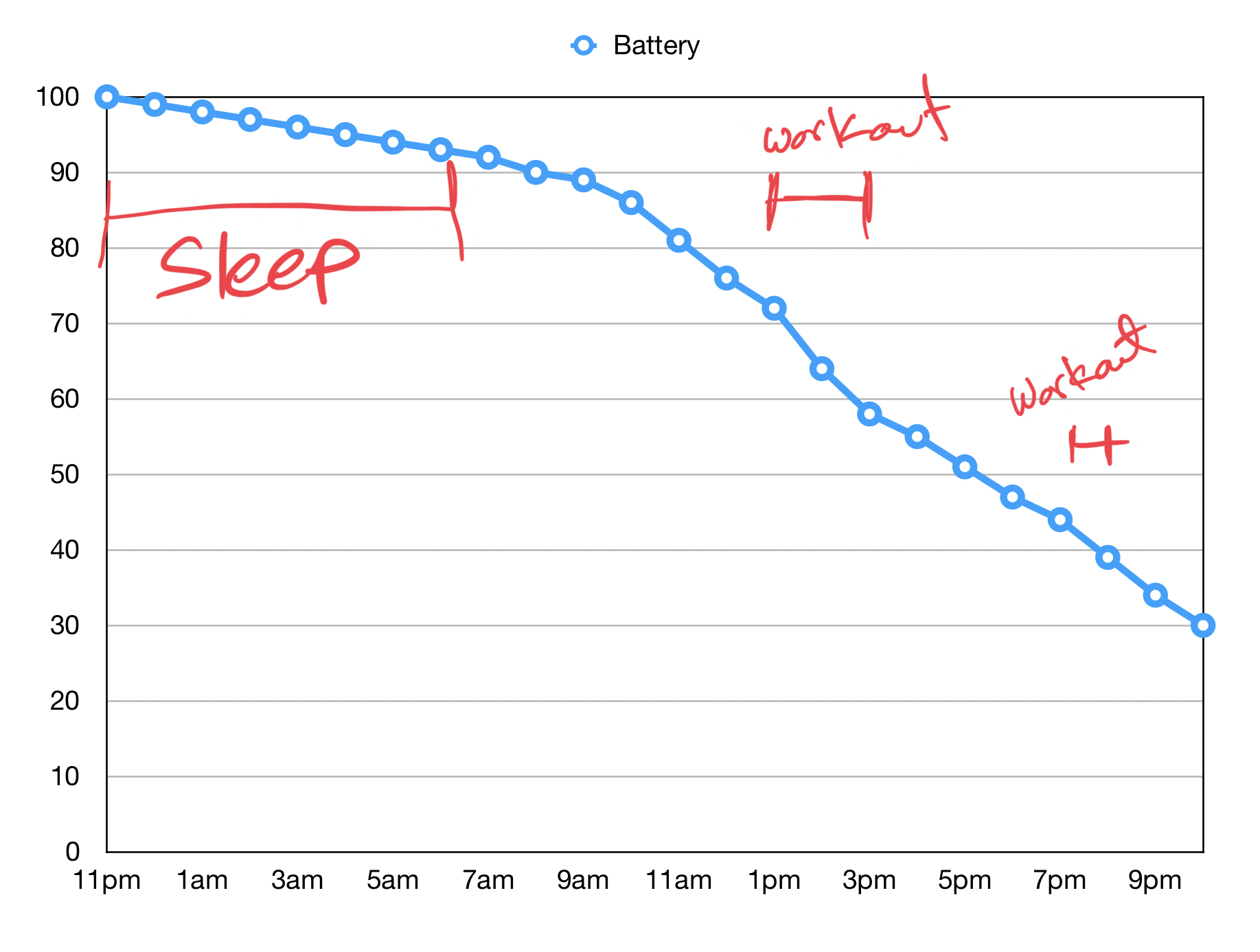
If I was writing this review in a vacuum this is where I would say that the battery life on the Apple Watch Series 5 is excellent and is right in line with what I have been getting from my Series 4 over the past year. I usually charge up my watch before I go to bed and wear it while I sleep (using Autosleep to track my sleep). I then wear it all day and night and put it on the charger for 30-60 minutes before I go to sleep. I even wore both watches for most of a day to see if they were any different and the results were…almost exactly the same with the Series 5 doing slightly better.
In my time with the Series 5 this behavior has been the same, and the watch has always been in the 30-40% battery range after 23 hours off the charger. Extrapolating out to 0%, I’ve always been on pace to get 36-48 hours out of this watch.
But I’m not writing this in a bubble, and the experience above is not universal. I wrote an explainer about what’s going on, but the short version is that some people are experiencing terrible battery life, often like 12 hours total. The problem seems to be almost exclusively with people who have the cellular model.
There is an update to watchOS coming soon that apparently solves this problem, but it is not out yet and it’s unclear how much it will help everyone with this issue.
This part of the review remains up in the air for now. I can tell you that I am very happy with the battery life and it has not changed my usage of the watch at all, but that’s not a universal experience right now. I’ll update this part of the review once watchOS 6.1 is out and we have better data on if it solves the battery issues others are having.
The Compass
The Apple Watch now has a compass built in. This was actually news to me as I kind of assumed it always had one, but apparently not. Anyway, some apps you’ll probably never use can take advantage of this, as will Maps, but you’d like the compass in your iPhone was already mostly handling this.
Anyway, this is a very minor change and the only reason it gets a shout out in this review is because it’s one of two changes to the product.
Buying Recommendations
If I’ve done my job as a reviewer you should already know whether this is a buy for you or not. But in case you skipped to the bottom or I just didn’t communicate as effectively as I’d like, here are my recommendations.
If you have never owned an Apple Watch before, this is a great time to jump on board. The always on screen makes this feel like a traditional watch more than ever and I think it makes the product fundamentally more useful. That said, if you are still unsure if a smartwatch is right for you, the Series 3 currently goes for $199, and will likely be closer to $129-149 over the holidays, and that’s still a damn good Apple Watch, so it’s a lower risk entry point into the ecosystem.
If you own a Series 4 then there is no reason to get this except the always on screen. If you have been waiting for this feature since the Series 0 and lost your mind when you saw Apple announce this feature on stage, then maybe this is worth it for you. As of writing, you can sell your Series 4 for about $300 on Swappa, which might make the upgrade not horribly painful. But seriously, that is the only difference, so you have to ask how important that difference is to you3.
If you own a Series 3 then I think this is a solid, if not essential update. The Series 3 is still quite fast and gets good battery life, so you’re really upgrading for the always on screen as well as all of the physical upgrades the Series 4 got last year. This is more a software thing, but you also get access to a ton more watch faces, as Apple seems to really only be adding watch faces to the Series 4/5 at this point.
If you own a Series 1 or 2 then this is a no-brainer update in my book. The performance updates are enormous and they will change how you use your watch, and the new physical design will make you go “whoa, this is nice.” You’re also likely not getting any more software updates after watchOS 6, so if you want to keep up with new functionality and improvements this is the time to jump onto a newer model.
And finally, if you have an original Apple Watch then I’m impressed you made it this long and this is going to be a huge update for you. Not only will it have nicer hardware, a battery battery, and tons more watch faces, it’s also going to jump you up from watchOS 4, which was the last update the original watch got.
- Only differences from the S4 to the S5 chip is stuff to handle the variable refresh display and the compass. ↩
- And slightly smaller, but just as sharp, in the 40mm model. ↩
- And again, there is no performance upgrade over the Series 4. The S5 chip is exactly as fast as the S4 and all the changes are around managing the variable refresh rate screen and compass functionality. ↩