iPads, MacBooks, Aspect Ratios, and Window Chrome
With my recent purchase of a MacBook Air, I now have two 13” computers in my life, the MacBook Air and iPad Pro (2018). What I find really interesting is that while my iPad Pro feels almost too expansive sometimes, the MacBook Air feels very cramped by comparison. Why is that? The Air technically has a 0.4” bigger display, so why does it feel smaller? I have some ideas.
Aspect Ratio

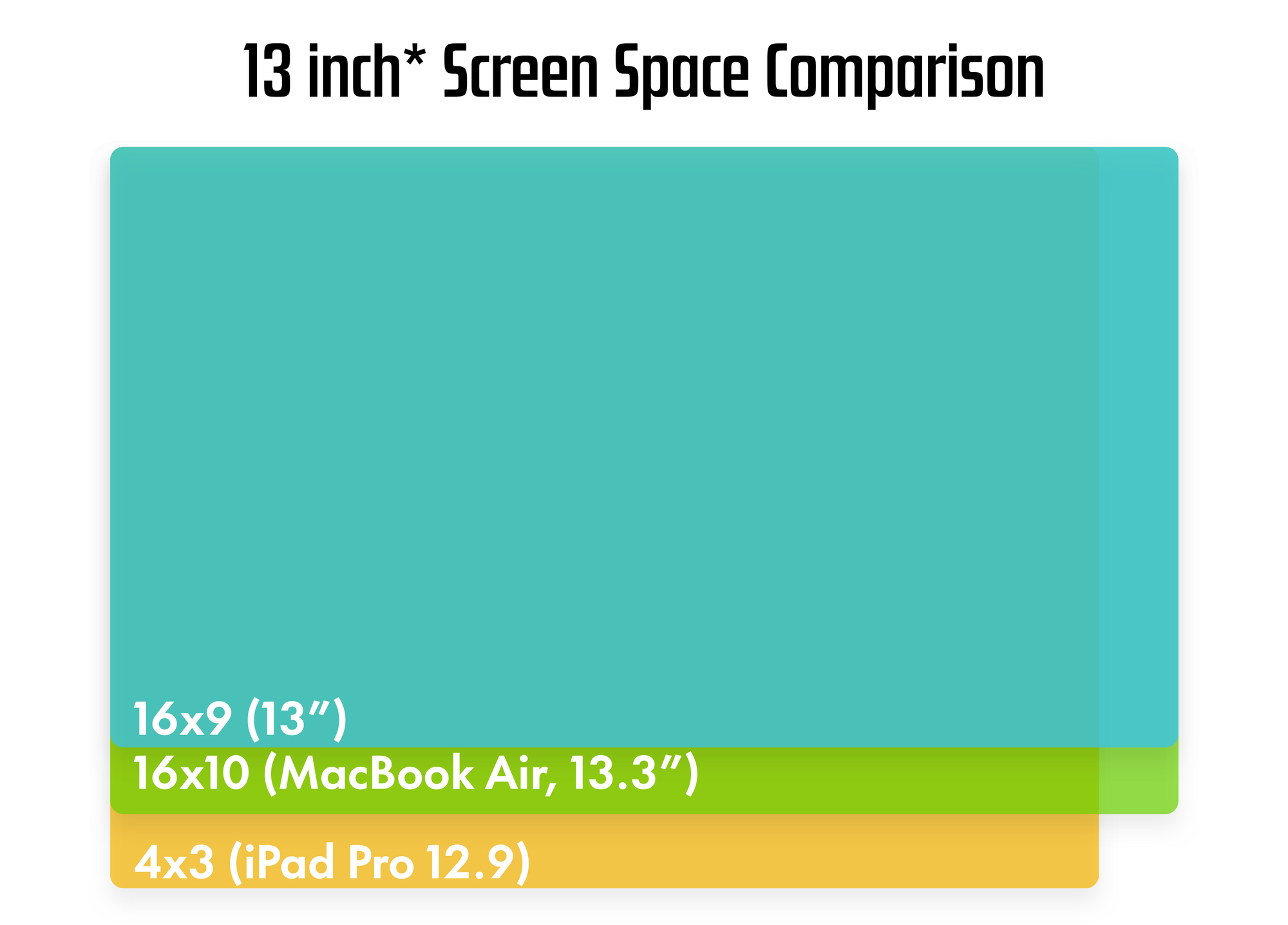
For total clarity, the above image shows a 13” display, the MacBook Air’s 13.3” display, and the iPad Pro’s 12.9” screen.
The MacBook Air has Apple’s traditional 16x10 aspect ratio, which is taller than the traditional Windows 16x9 ratio, but is still pretty darn wide. By comparison, the iPad Pro is a more squared off 16x12 ratio (more commonly referred to as 4x3). So while the iPad is a bit narrower when used in its primary landscape orientation, it is taller, letting more information fit on screen at once.
I’m on the record more than once that I want to see Apple make some big changes to their portable Macs, and a more squared off aspect ratio is definitely on the list. Yes, this would mean even more black bars when watching 16x9 content on MacBooks, but the iPad is derided as “just being good for video watching” all the time, so I’m not super persuaded by that argument.
Window Chrome
I’m writing this on my iPad Pro, and Ulysses is taking up the full screen, with about a centimeter at the top of the page for the status bar and app icons, and the bottom centimeter for the keyboard options. The rest of the screen is dedicated to the app, and most iPad apps are built from the ground up to have as little visual clutter as possible.
Meanwhile, macOS is full of UI at all times. The menu bar, the dock, and apps in general have more window chrome. And with the fundamental act of windowing your apps, you are never utilizing the full screen space of your Mac with any single app. Yes, I know there is full screen mode, you can hide the dock, and the window chrome is also a feature, but it’s still not the same.
I think this is a fundamental difference between mac OS and iPadOS. iPad apps are typically variants of iPhone apps, so the developer has already tried to make a great experience on a 5” screen, so it feels liberating and luxurious when that UI gets to occupy a much larger screen. By comparison, Mac apps are meant to work on a massive 30” screen, but also smaller 13” screens. I’m sure this differs for some people, but for me the fact that 13” is the biggest screen iPad apps run on means they feel like they have tons of space, while 13” being the smallest screen Mac apps run means they feel cramped.
Takeaway
This isn’t to say the Mac is bad by any means, I’m just working through why the same advertised screen space feels so different to me on two different devices.