Logitech MX Master 3 Review
People speak highly Logitech’s MX Master line of mice, and I’ve joined the chorus over the past few years since I got one for myself. I loved it, but it was basically the last device is my life using micro-USB and I lamented literally days ago that all I wanted was a new MX Master with USB-C. Thankfully, Logitech has come through with the MX Master 3 which adds USB-C and a whole lot more.
What’s New?
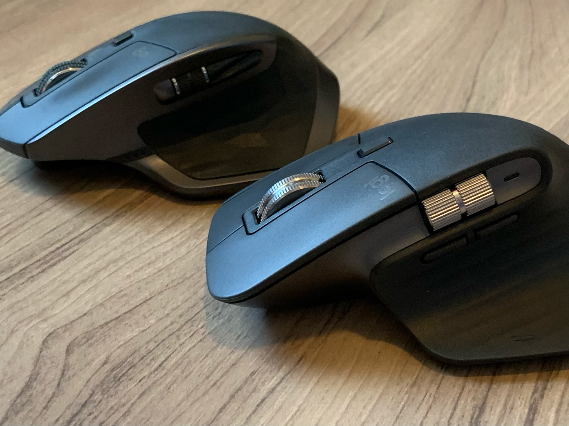
- New colors, graphite and “mid gray”
- Metal scroll wheels instead of plastic
- App-specific button setups for some Apple, Adobe, and Microsoft apps
- USB-C quick charging (3 hours from one minute of charging)
- Linux drivers for “most popular Linux distributions”
What’s the Same?
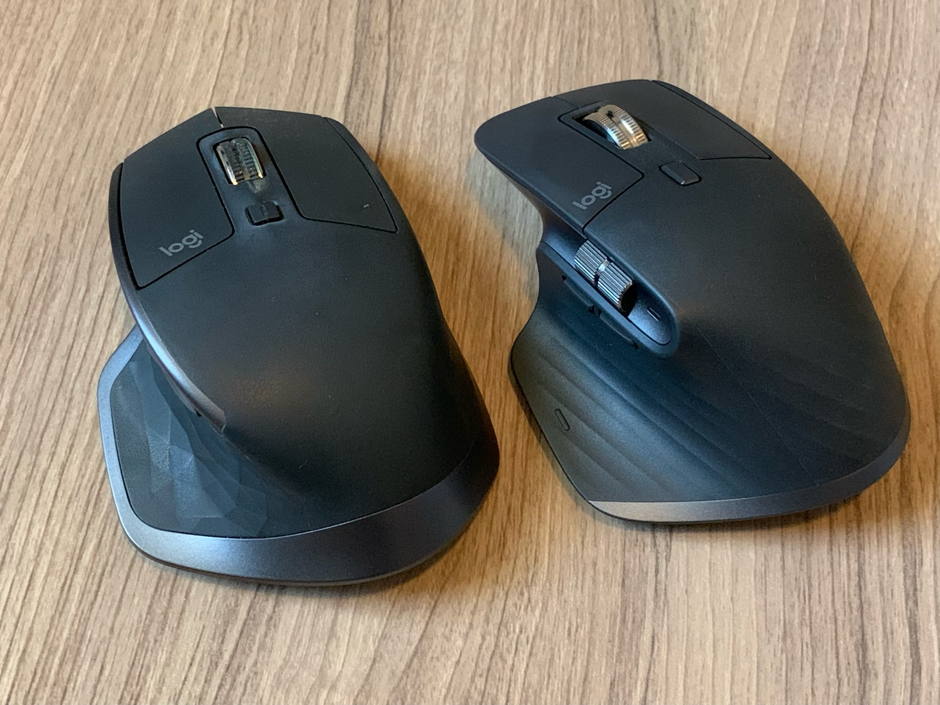
Most things on this mouse are the same as the last model.
- Same 500 mAh battery that lasts 70 days
- Same 7 buttons as before
- Same 4,000 DPI tracking accuracy
- Same 3 device pairing that can be toggled from buttons on the bottom
- Same Bluetooth or Logitech unifying USB receiver
- Same Logitech Options software
- Same Flow feature for copy/pasting between computers
- Same price of $99.99
- Still only works as a wireless mouse, even if it’s plugged in with the USB cable
Feel (and a Disclaimer)
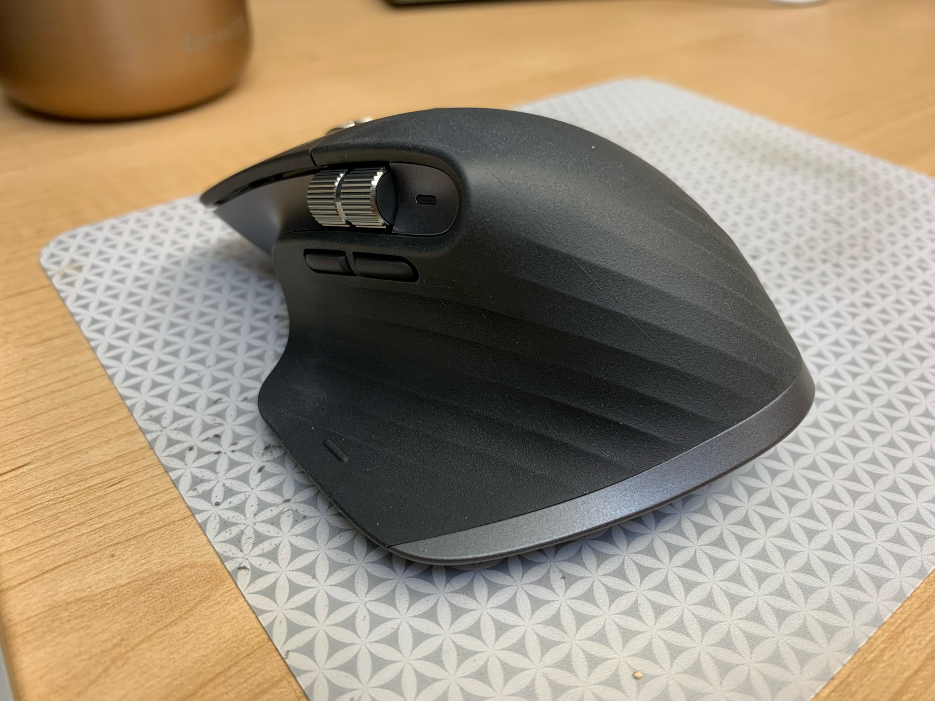
The MX Master 2S is the best feeling mouse I’ve ever used. It fits perfectly in my hand and has removed all instances of hand strain when using a computer for many hours in a day. The new version feels very similar, but was immediately distinct from the last model. I’ve used it for 2 days now and the difference is already pretty much gone, so I’ve gotten used to it quickly, but I’d say this mouse feels little narrower in the hand than the last one. I don’t know if that’s technically true, but that’s how it feels to me.
The disclaimer on this is that I have of course only used this mouse for a few days and i may feel differently in a few months, but my initial impressions are “slightly different, but not in a bad way.”
The New Scroll Wheel
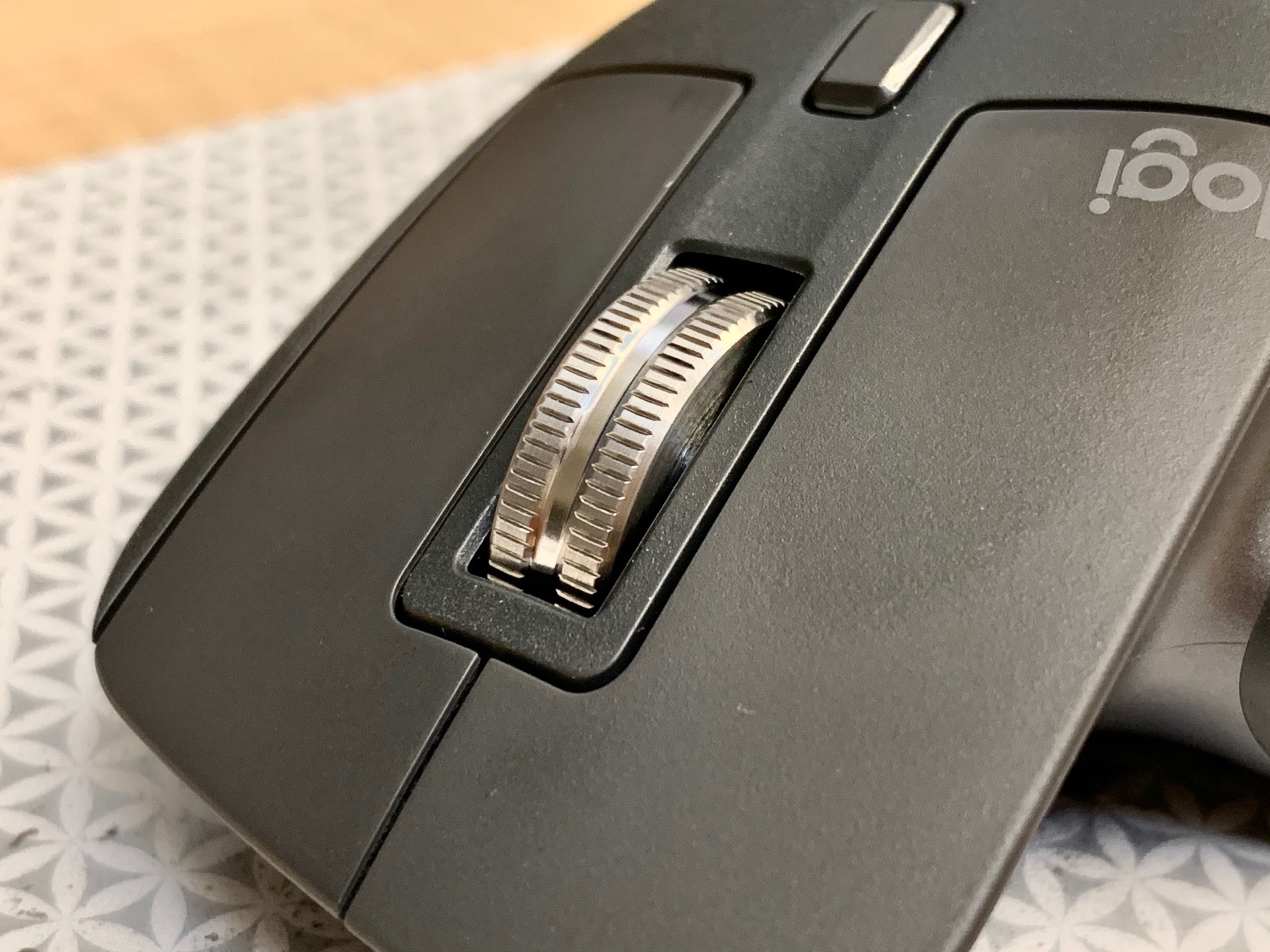
This is the real star of the show for me. The Master 3 uses a magnet system of some sort to hold the wheel in place and it spins and spins and spins… Seriously, the old model was great here, but the new one puts it to shame.
And even more important to me, as someone who works in an open office, the wheel is effectively silent when it’s spinning. The old one was quiet, but if the room was quiet, everyone could hear me crank on the wheel as I scrolled down a super long document. Not anymore, as the new wheel is inaudible even to me, sitting 2 feet from it.
If you prefer to use your mouse wheel the traditional way in the “ratchet” style, it can of course do that too, but the mechanism is totally changed, and I think uses the same magnet system to stagger your scrolling and provide haptic feedback. This is also quieter than I’m used to from a mouse and it did feel a little different from other mice I’ve used, but I never use this mode so I mostly went “huh, that’s interesting, but whatever.”
Finally, it’s not a big deal, but the wheel is now made from metal instead of plastic and it makes it just feel really, really good.
The Other Buttons and Wheels
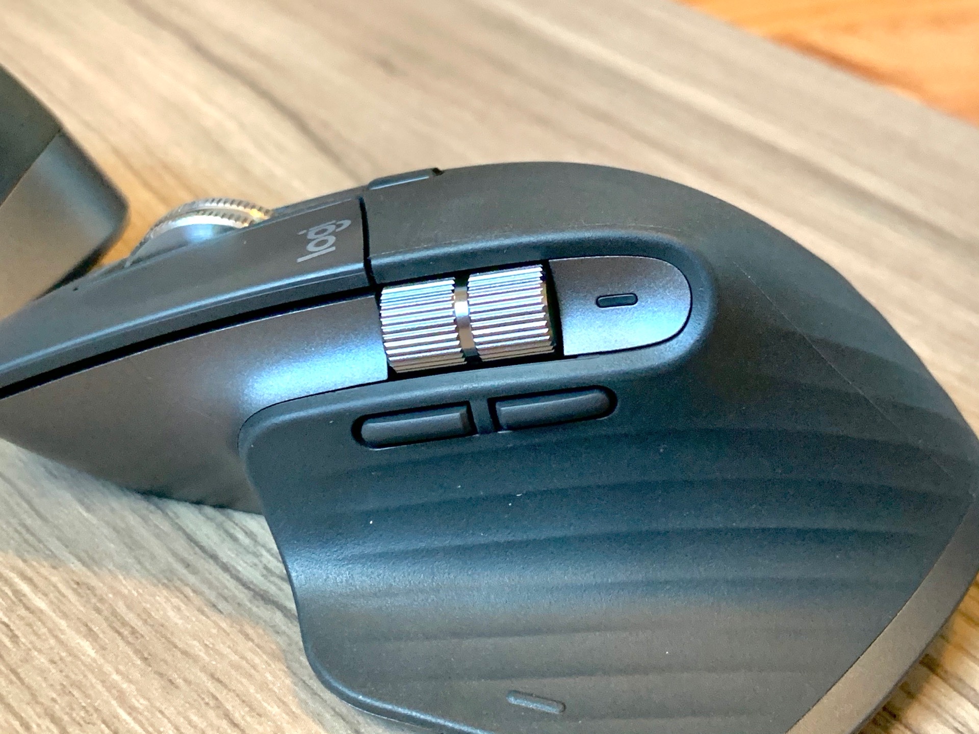
There are an assortment of other buttons on the mouse, and while this is not a gaming mouse by any means, it has plenty of options for being a “professional mouse user.”
Button on top. This button can either toggle the scroll wheel between modes, or you can assign it to specific functions on your computer. I have this set up to simulate a keypress that Keyboard Maestro uses to open the main kanaban board in Jira. Thrilling, I know, but it’s a page I have to go to a ton and many of my conversations start “hey, could you check out task…” so being able to pull up my board at a moment’s notice is a huge feature.
Back and forward buttons. These are markedly different from the last version of the mouse and I think they look wore, but are easier to use. The old style had these kind of stacked together and the back button was pretty easy to hit, but the forward one was a bit out of the way. They were so close together I also sometimes accidentally hit one when I meant to hit the other. No more as these are completely broken apart and rise out more from the side of the mouse than before. They’re easier to find, and hit the right one, although they are exactly the same shape, so there still could be an issue with mixing them up from time to time, but it has not been a problem for me yet.
Side wheel. This wheel on the side of the mouse is a little nicer than the last model’s. It too is made of metal this time and feels nice, with sharp ridges that make it easy to turn with a light touch. I do wish that this also had the free scrolling option that the main scroll wheel has, since I find scrolling things like Final Cut timelines or large documents in Sketch takes longer than I’d like.
Gesture button. This was on the last version as well and works basically the same as before. The only difference is there is a little nubbin that reminds you the button is there, but I still don’t use this for much. I know some people get value from it, but it’s still placed too far down and back on the mouse to make it easy to access with my thumb and I generally end up just ignoring it.
Wireless Only
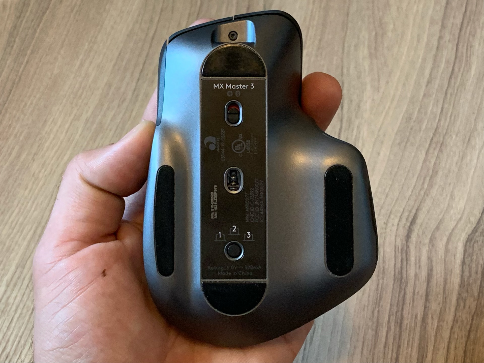
The Master 3 is a wireless-only mouse. This means that even if you plug it into a computer with the included USB-C cable, it will only charge over that cable, not actually become a wired mouse. This isn’t a big deal most of the time, but sometimes your computer might not have Bluetooth active or you’ll want to use it with something like a Raspberry Pi which has not been set up yet to turn on and sync over Bluetooth. In these situations you are basically SOL unless you have a wired mouse around.
In theory the bundled Unifying dongle might work, but I think you need to “sync: your mouse with that specific dongle before it’ll work with any old computer. I never use this dongle, so I’m not 100% sure, but make sure you hold onto it juuuuuust in case.
Worth an Upgrade?
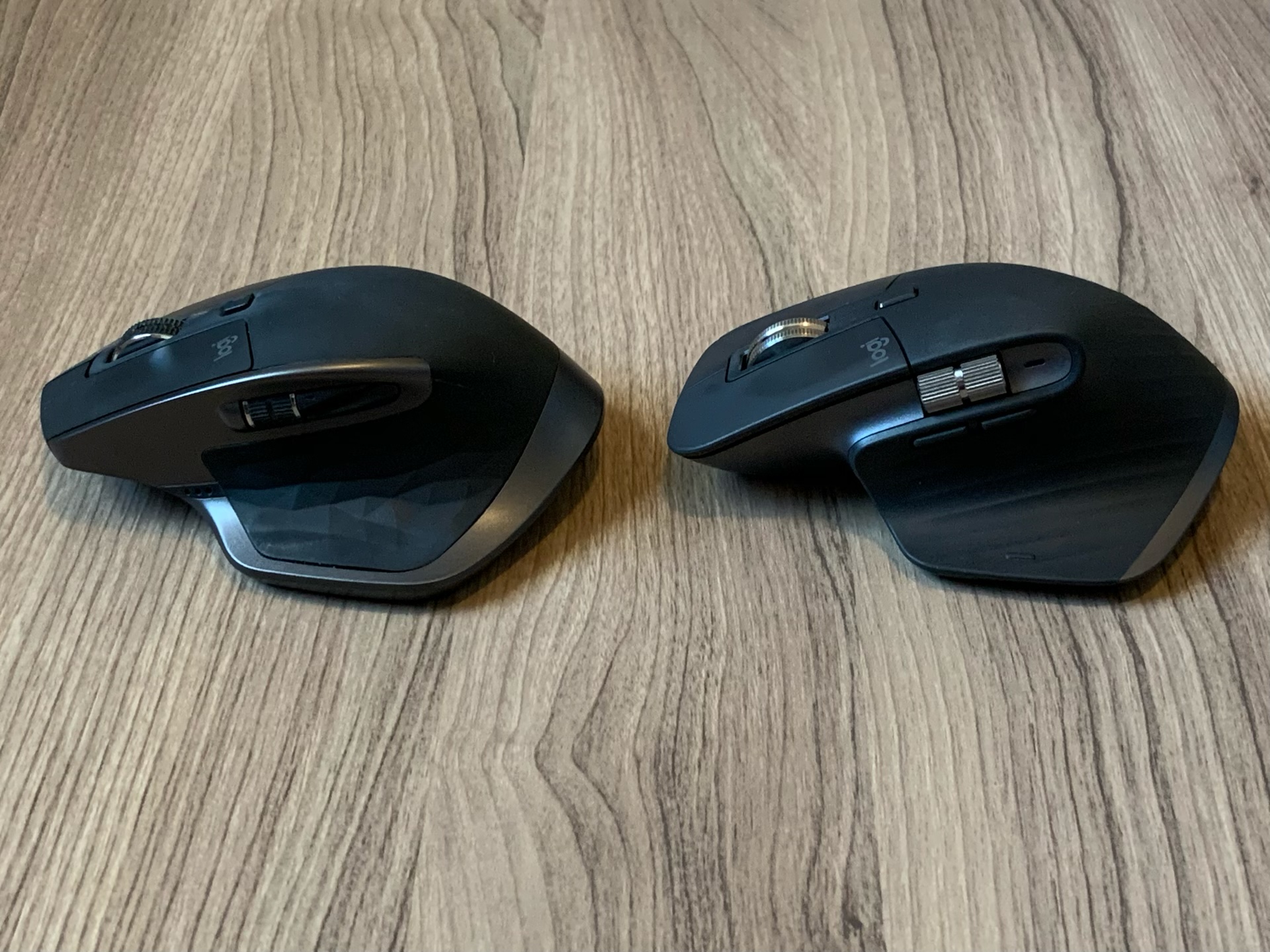
I think the changes to this mouse don’t make it a must buy for anyone using an MX Master 2S but there are a few things that made me find this a totally worthwhile buy.
- USB-C is enough of an upgrade for me to get basically anything. Unifying my cables to one plug has been revelatory over the past couple years and this removes the one micro-USB cable I had to keep around for semi-regular use.
- The ultra-premium feeling scroll wheels are excellent and make the mouse a joy to use. I know this is technically unnecessary, but I like nice tech and this feels like a killer upgrade.
If neither of those speak to you, then feel free to stick with the 2S and not feel any FOMO.
But if you are looking for a new mouse and have literally anything else, then I think the MX Master 3 is a great option and one that should definitely be on your radar. The price definitely keeps it in premium territory, but for something you likely use for 8+ hours a day, you should really do everything you can to get the best option you can budget for.
It’s worth noting that Logitech is still selling the MX Master 2S for $79, but I’d say that the $20 price difference is worth paying to get the newer model, if only so you don’t bring another micro-USB device into your home or work in 2019.