Serious question, where is the Android home screen innovation?
One thing that iOS gets flack for all the time is that lack of innovation in their home screen. "The grid of icons hasn't changed since iOS 1!" is something I hear regularly, especially when someone is comparing iOS and Android. And I've often nodded along with these complaints, but for all the criticism Apple gets for the iOS home screen, the Android home screen is not exactly that much better. Here's my home screen on the "much more advanced" Android home screen:
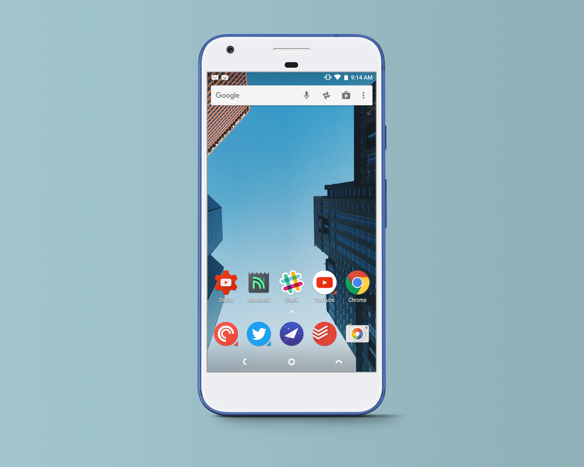
Stunning, right?!
Now I do like the fact that I can place icons wherever I'd like, and the option to have widgets on the home screen (even if most Android widgets suck) is nice, but this is what most most people who care about this stuff do with their home screens too. As a sampling, here are the home screens from the top 5 reviews of the new Samsung Galaxy S8:
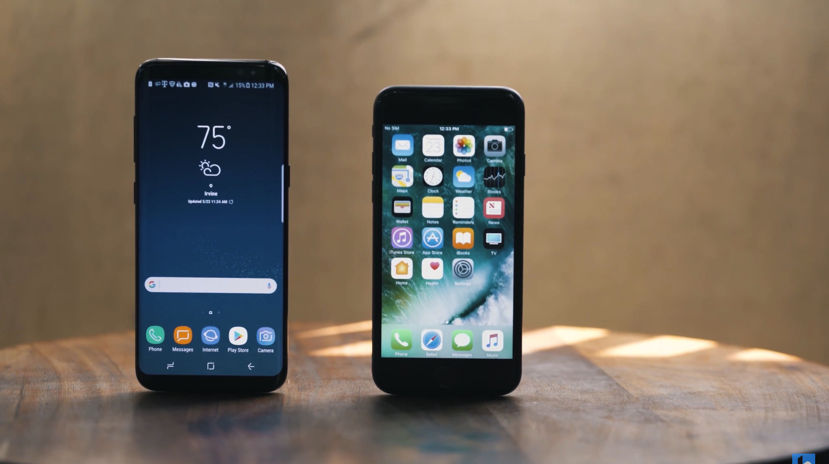
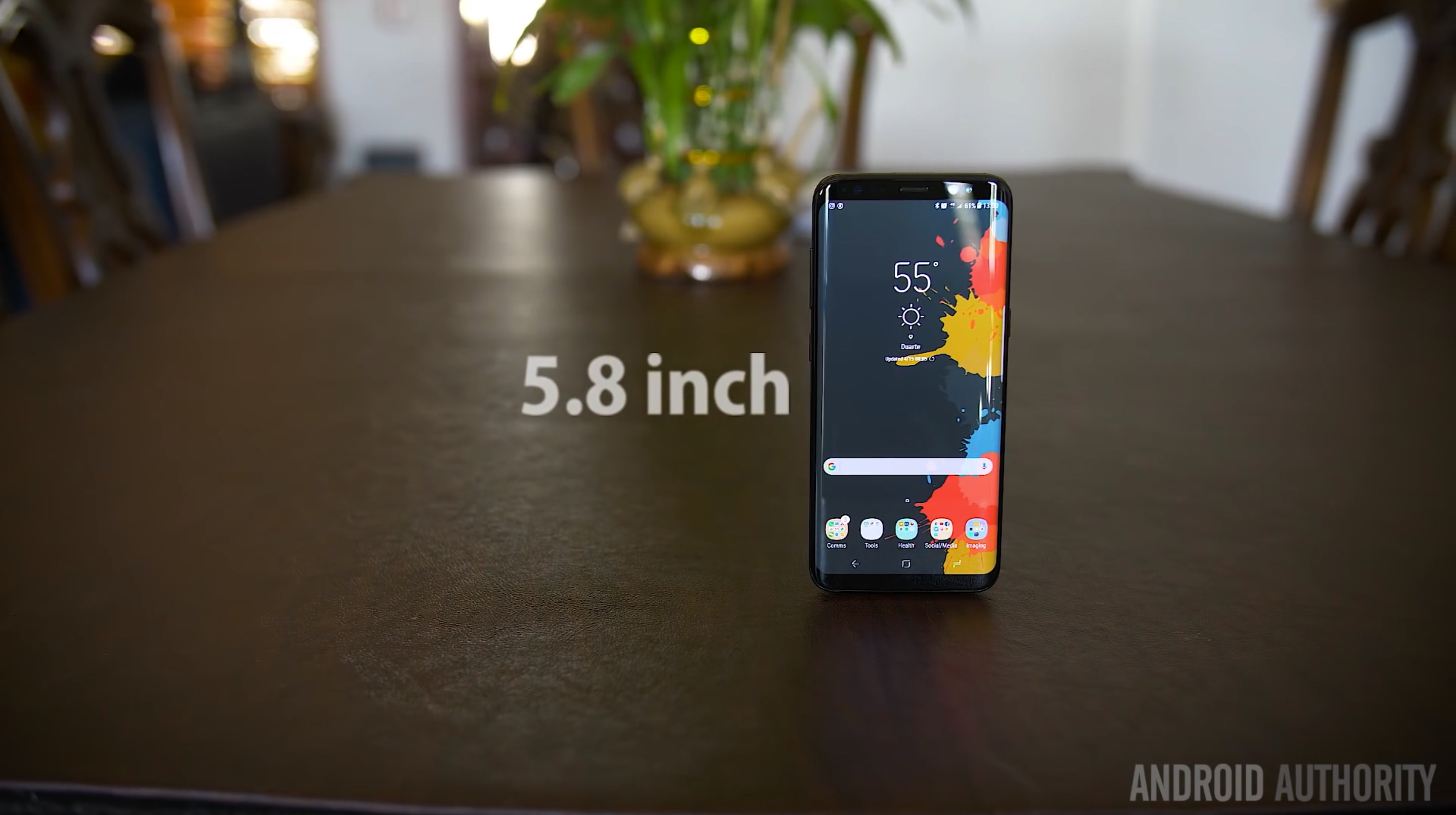
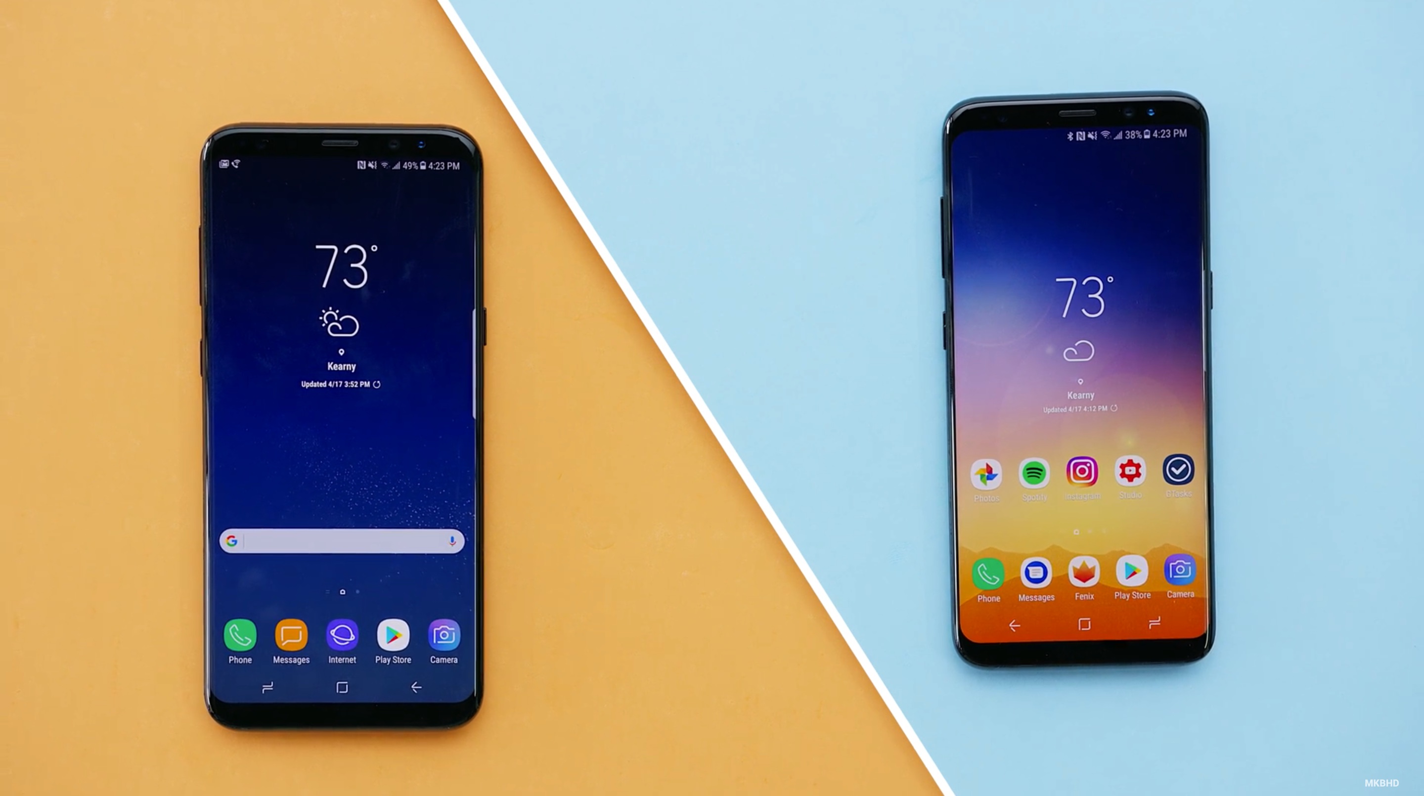
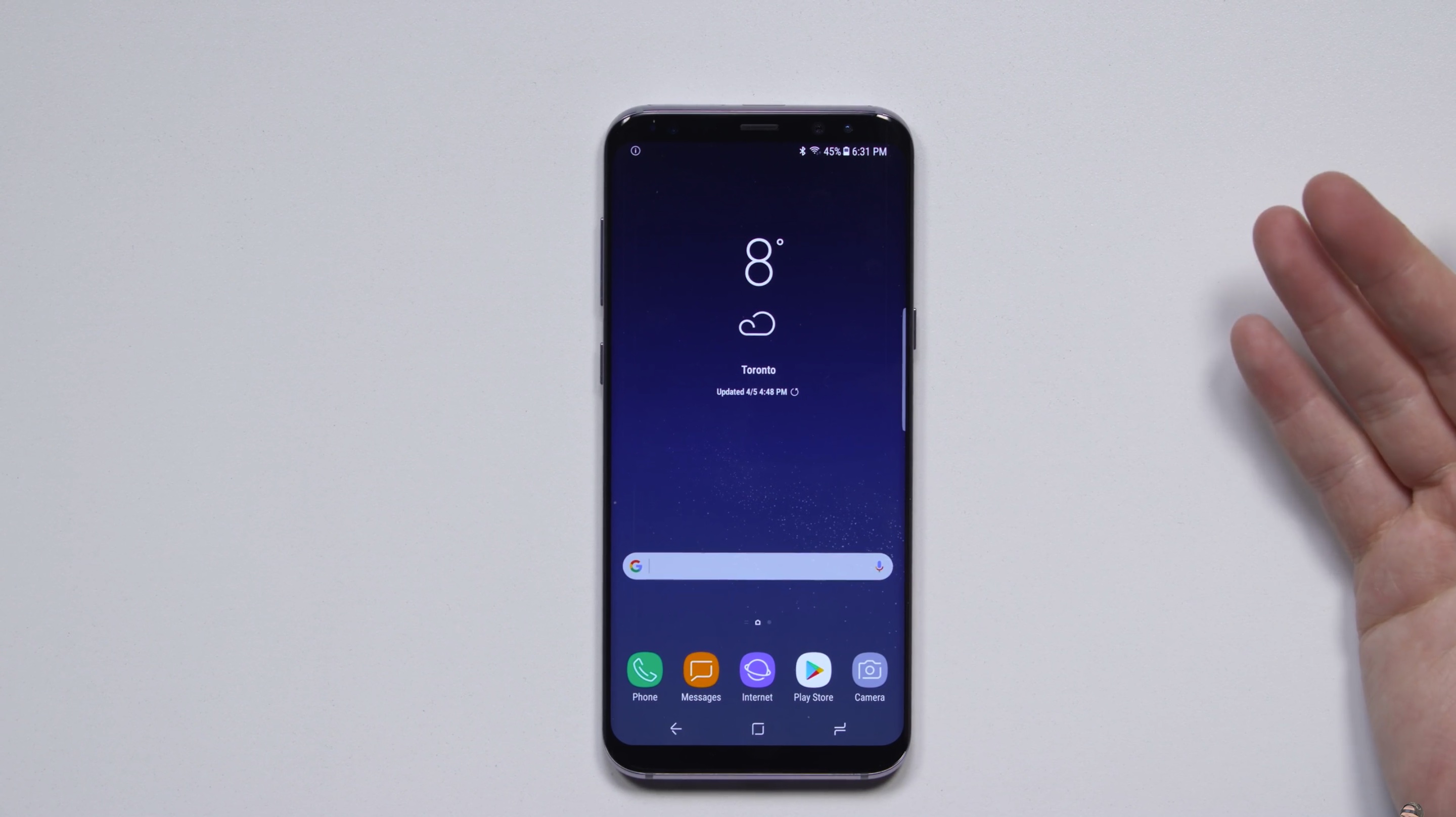
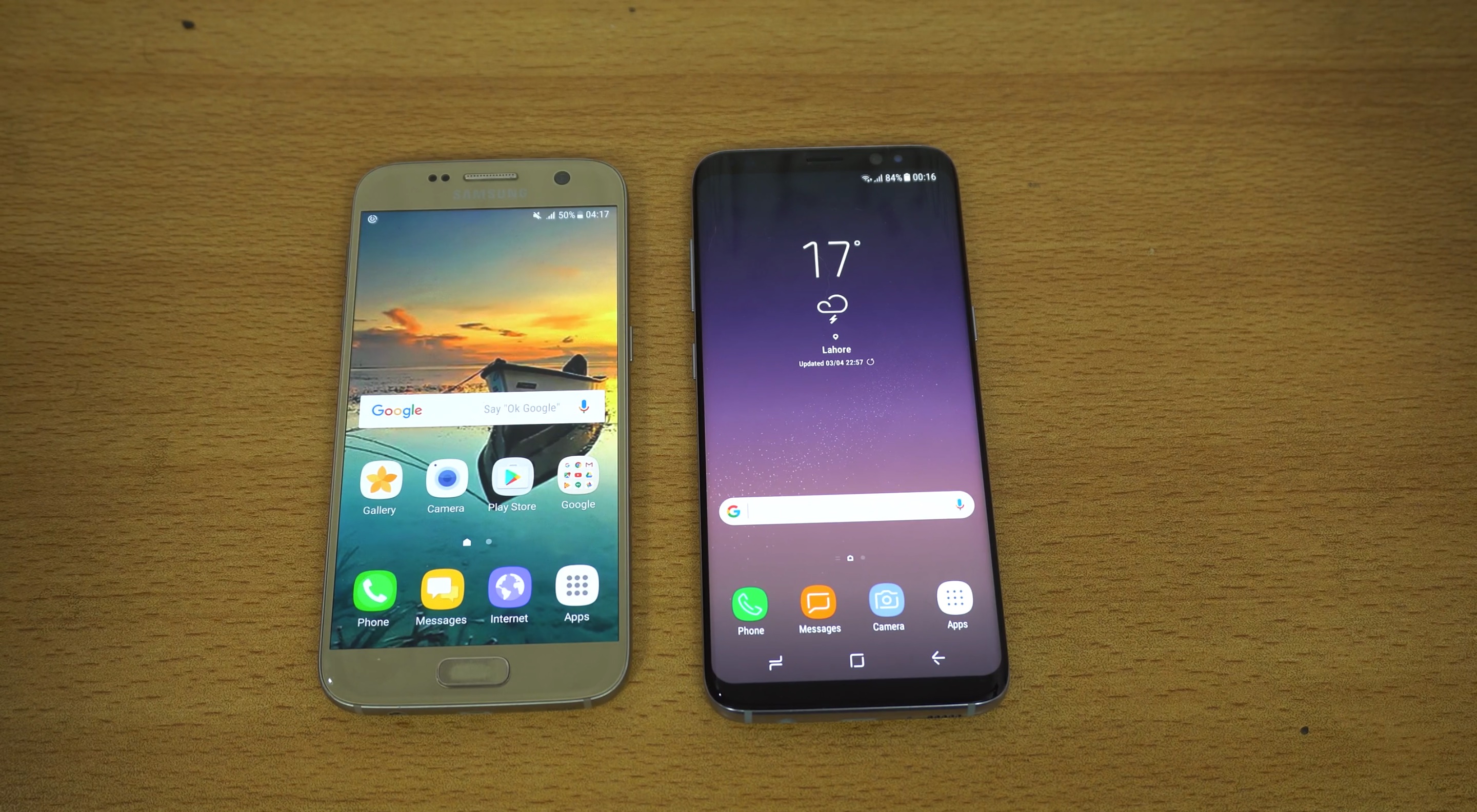
Wow, such diversity! But okay, okay, I hear what you're saying, this is one phone and most of these just left the stock look that Samsung ships with the phone. Fine, let's look at the other top of the line Android phone, the Google Pixel:
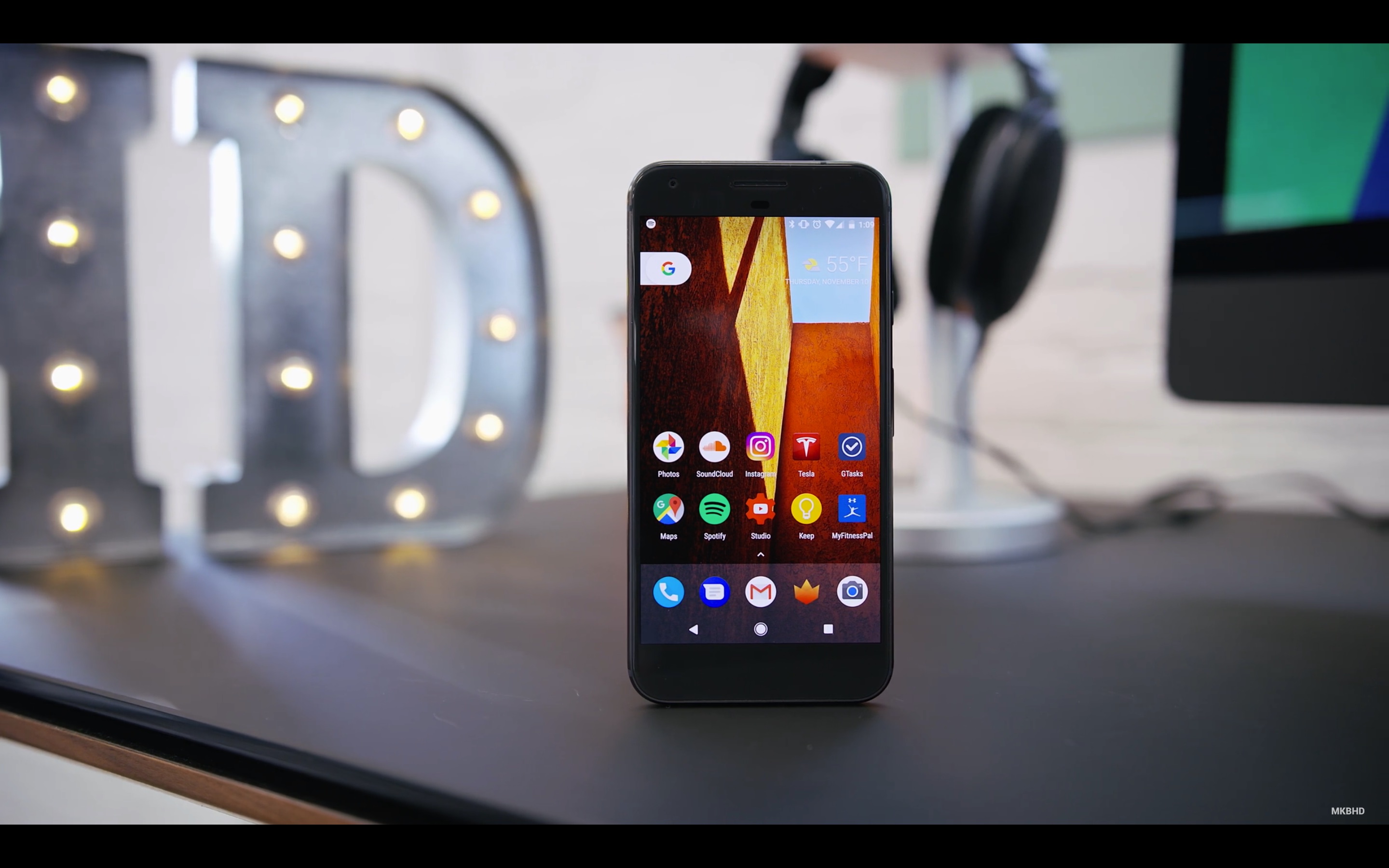
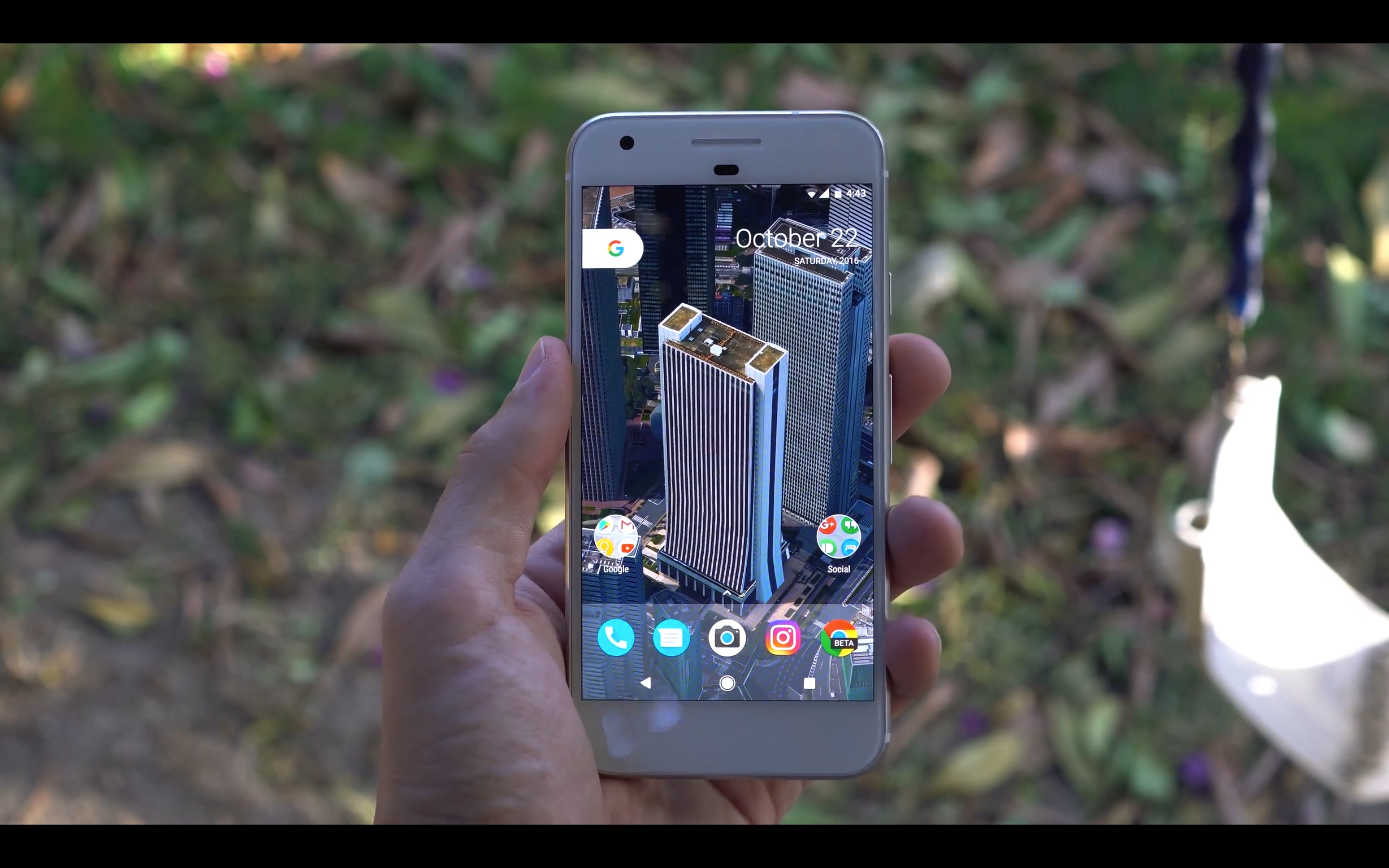
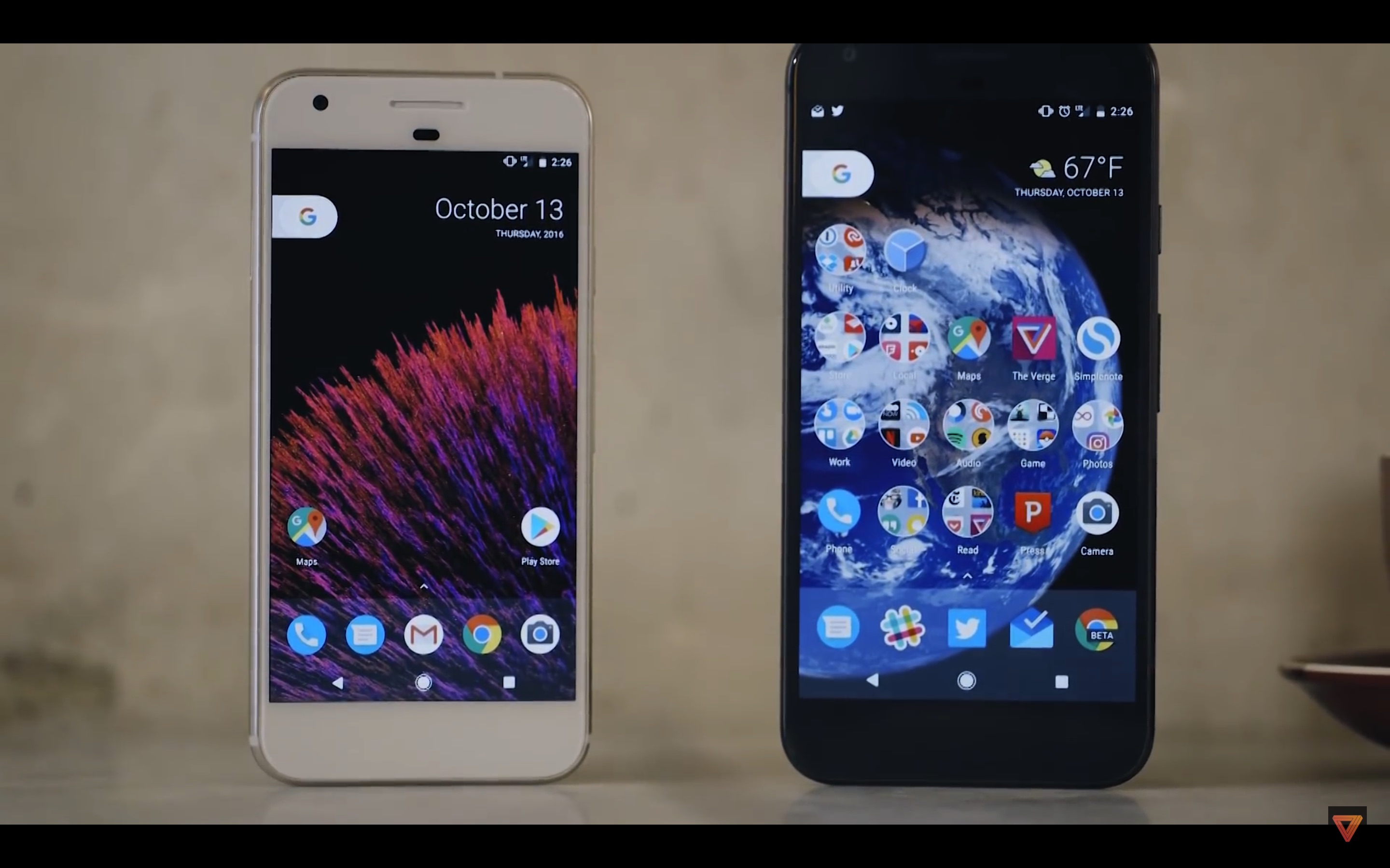
It would appear that given the option to do more with their home screens, most people will stick with the grid of icons, thank you very much.
Now this is not to say Apple and Google should not be doing things to advance the home screens on both their platforms, and I've written about this before, but this narrative that Android is a bastion of freedom and everyone is able able to make a home screen that is totally unique to them is a bit of an overstatement. Android undoubtedly has more flexibility with it's home screen, but beyond moving icons to the bottom of the screen, it doesn't seem like a thing most people take advantage of.
As a side note, if we want to talk about home screen progress, let's take a look a the home screen on the Nexus One in 2009:
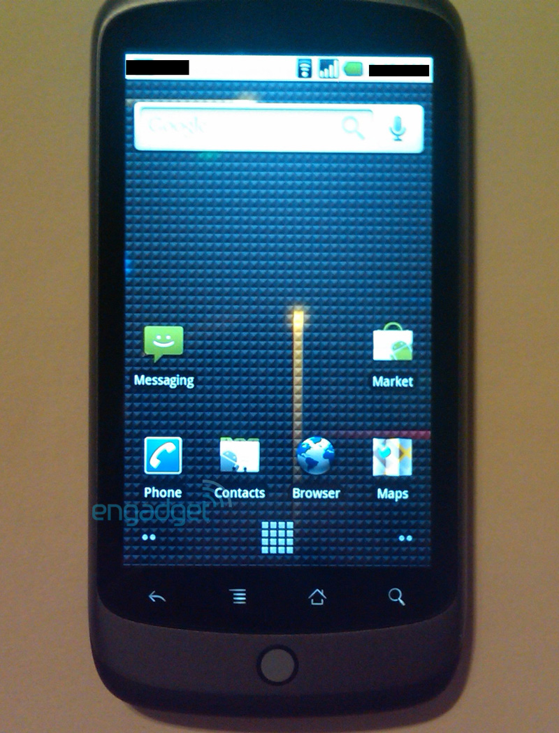
That's basically a carbon copy of what people are doing on their home screens today. Icons in a grid at the bottom and a search bar at the top.